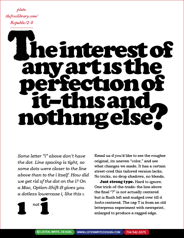
| What's the difference between ultra-tight letter spacing as above, and just jamming/cramming the letters together? — Typographic tailoring. Noodling. Futzing. Revising. The art aspect of that craft. Set very tight but readable. Headline type need not always be bold as it is above to attract readers. It can also be "cast against type" to vamp you in. The only i with a dot is on the top line. Would you like to see the untailored original? lwd@listenwritedesign.com . | | |