
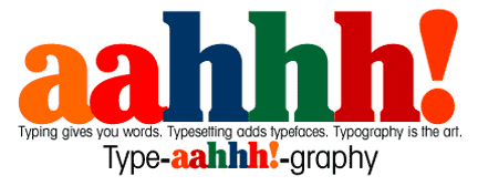
|
Herb Lubalin, one of Larry's idols, with Ralph and Shoshana Ginzburg, created publications Fact, Eros, Moneysworth, Avant Garde. | |
| Let us help you pick the right typeface. It's fun and important but let's go further. | Many desktop publishing designers use the same two typefaces, Times Roman and Helvetica— or go nuts with a wild blizzard of typefaces. Even if you wish to appear conventional, there are many choices other than Times for text or Helvetica for a display typeface. |
| Let us help you mix the right typefaces. To mix an effective combination of typefaces. That's the art. Mixing. Example of refinement Test of refinement: | (For example, Let's mix the tried-n-true combination: Century Old Style and ITC Franklin Gothic Heavy.) (For example, avoid Century Old Style with any Garamond, or with Galliard. Avoid ITC Franklin Gothic with Helvetica or with Frutiger, or Helvetica with Frutiger. Frutiger and Galliard? What do you think?) Let Listen, Write, Design, help you make the best type design choices, using our large type library. We'll set "dummy" headlines and body copy so you can see dramatically how our creativity will enhance yours. We can help you buy digital type, too. You know, there is no substitute for a really good type library. |
| Ask us to help fix up your type layout. Via PDF. Example of refinement: | Via PDF, inexpensively, like our basic design consulting service Maybe your columns are the wrong width, typeface too small, line spacing too tight, text hard to read or inappropriate for subject matter. Perhaps paragraphs are too long, hy-phe-na-tion too frequent, subheads too weak. Example: Does coworker hyphenate as cow- If you prefer to be outrageous and contrarian, we will lead you to out-of-the-box typography. Example: Everyone tries to avoid typographic widows. But in ads, they can enhance readability. We'll help you revamp your project by looking at the big typographic concept and the small typographic details that make it really work. |
| Here are three ways Listen, Write, Design, and outside typesetters can refine your actual typesetting. To one of three ascending levels. Example of refinement | Level 1. Good. Lowest cost. We'll provide type specs you can implement on your own, including: Typeface, size, width, leading, spacing, hyphenation. You do the rest. This approach gives you the the most fun, the most work. Use Level 1 for any job where the quality of the impression you make can enhance or hurt company image, can enhance or hurt your relationships with financial resources, can enhance or hurt the possibility of selling your company. Level 2. Better. Moderate cost. Use Level 2 for any important job except those we mention below. Level 3. Best. And expensive. (And don't let your printer ruin it by using their "house sheet" — usually an OK but not impressive paper stock selection. Printers should discount paper if you use a house sheet.) |
 Feedback! Questions? Anticipatory pleasure? Phone 980.245.2323 You may enjoy our typographic mini-posters
| |